2. Make it accessible
Good design should work for everyone. That includes those who experience sight and hearing disabilities. Consider, for instance, the 8% of men who are colorblind. Though that may seem like a small percentage of the population, it actually equals over 26 million American men.
By conforming to accessibility standards in your UX practices, you’ll increase the number of people who can interact with your product or site. Ultimately, it’s about empathizing with your audience. When you design your site, check its level of accessibility with evaluation tools available online. You’ll be given a list of improvements you can make to improve your accessibility.
3. Keep it consistent
Consistency is a core tenet of UI/UX best practices. Design consistency limits confusion, builds trust, and reinforces your brand. When your UX design is consistent, users will learn how to navigate your UI faster and will be able to execute their tasks with less distraction and confusion.
When applying this UX practice to your design, focus on these key elements:
- Visual consistency—This includes the fonts, buttons, colors, images, and other visual elements you use across your product or site design.
- Functional consistency—Similar controls and functions work the same way to maintain predictability and intuitive navigation from page to page, and even between products under one brand.
- Voice and tone—Stick to a consistent voice and tone in the way you speak to your users through your product. This includes everything from homepage copy to your error messages.
Familiar patterns—Don’t reinvent the wheel with every UX design. Users will be familiar with certain UX patterns across the digital space, so look to include these patterns in your design to make the experience seamless.
4. Make a sitemap
No one wants to get lost in life or on your site. A map will help. A sitemap is a vital tool of good UX design. They visualize your site's organizational hierarchy and map out how each page relates to each other. Creating a sitemap also helps both you and your user navigate the site to find the right information and products.
Plus, when you want to add to your site, you can clearly understand where a new page should live. Further, when you delete a page, it still lives forever as a 404, so you’ll need to keep track of your redirects. Maintaining an updated and well-organized sitemap can ensure these details don’t fall through the cracks.
Lucidspark offers a free website flowchart template. It’s a great place to start.
5. Use clear navigation tools
Clear, consistent navigation from page to page can make a huge difference in how people experience your site. There should be a sticky header, which is a navigation bar that stays in the same place from page to page, at the top of the screen.
Your users have pre-established behaviors and expectations from over a decade of using internet products. So, among other things, they expect to find a search bar at the top of your page, organized drop-down menus that lead to landing pages, and a log-in button. Similarly, at the bottom of your page, your users expect to find company information, contact info, and links to the career pages.
6. Keep copy clear
Your users don’t want to have to guess what you mean. If you label a button “Shop now,” your user will expect to be taken to a product page where they’ll have the ability to buy. On the other hand, if a button says, “Join now,” your user likely has questions: What are they joining? Why should they join? Is there a buffet? When writing for users, your copy should be concise, clear, and accessible.
When we say “accessible,” here, we mean that your writing should be at about an 8th-grade reading level and should not require any specialized knowledge. An error message, for instance, should not go into the details of why a page isn’t loading. It should simply say “Page cannot load.”
7. Test and test again
Usability testing is easier than ever. Before you launch your site, test in a staging environment so you’re not altering a live site. Then, use data to constantly improve your site’s design. Consider A/B testing and heat mapping as well as recording live feedback from users as they interact with your site or product. Then, adjust according to the results and test again.
Your design is a living piece of art that will continually evolve and improve, so don’t allow it to remain stagnant for too long.
8. Design to context
Look at your site analytics to determine how your users are engaging with your product. If most of your users are on a mobile device, you’ll need to prioritize design for ease on the go. If most of your users are iPhone users, you’ll want to incorporate Apple Pay.
9. Keep it simple
Humans love white space. It helps brains better process information and decreases cognitive load. While it may be tempting to create complex designs with fancy animations, it’s ultimately best to keep design simple, easy to understand, and fast. Avoid colored backgrounds or cluttered text boxes. Keep text minimal and images clear.
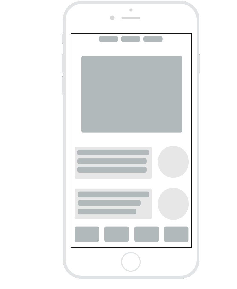
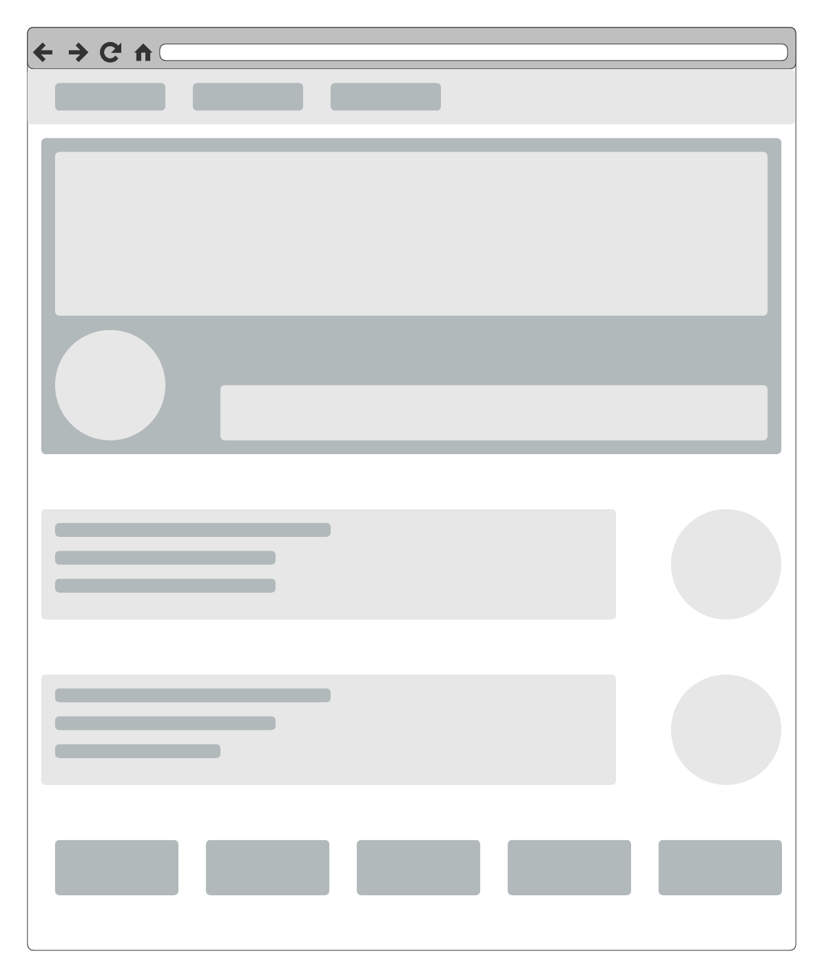
In the early stages of design, consider creating low-fidelity mockups to boil your webpages or applications down to the most important design elements.
Consider these templates to get started.