Did you know that up to 90% of people’s subconscious judgments are based on color alone? You might not realize it, but the colors you use at work speak volumes, impacting everything from collaboration to communication and productivity.
To dive deeper into the power of color, we met with Jill Morton, CEO of Colorcom and director of the International Color Research Institute. According to Morton, we’re a “color-hungry species,” and our brains are wired to react to color faster than words. "Color helps us remember, express ideas, and feel connected," she says. "It’s one of the fastest ways to tag meaning to visual information."
Colorful screens dominate our workdays. Whether we're navigating documents, apps, or platforms, we're constantly surrounded by color, often in ways that subtly shape our reactions and emotions, as well as how we process information and make decisions. Without intention, all that color quickly becomes noise.
Let’s take a look at a few tips and tricks from Morton to help your team use color to improve alignment, encourage creativity, and foster psychological safety.
Tip #1: Don’t be a “beige boss”
Color is deeply tied to personal identity, with preferences ranging across personal experiences, cultures, and generations. With this in mind, Morton shared, “The research shows that when you surround yourself with a favorite color, especially in your workspace, you literally feel better mentally and are more productive.”
Not everything at work should be standard black-and-white documentation. A “beige boss” might play it too safe, favoring dull or neutral colors. Bringing your favorite colors into your work in Lucid, as well as encouraging team members to use their preferred colors, is one easy way to improve engagement and even boost your mood as your team collaborates!
Tip #2: Do use color to clearly move projects forward
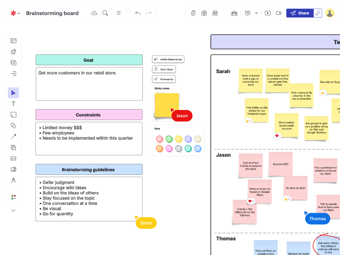
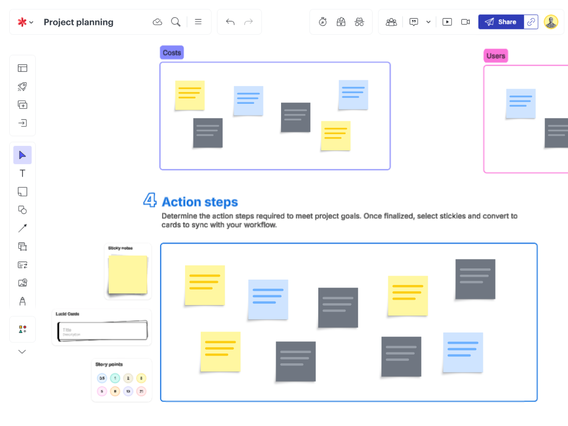
Color is key in identifying and organizing content. Its placement in a board can make colors—and therefore, the content—easier or more difficult to follow. Color coding systems will vary by projects and team members, but consistently using the same one can streamline communication, helping team members clearly identify priorities and contributions, and ultimately help avoid confusion.
Morton described how light and muted colors are the most peaceful and create the most “visual comfort.” On the other hand, bright colors are typically the most energetic, while dark colors are seen as the strongest and most serious. Why does that matter in a platform like Lucid? Let’s say you need creative input to determine the future state. Use softer pastel colors to promote calmer discussions, especially for strategic decision-making. If something needs immediate action, highlight it in bold, highly visible colors that grab attention. You can also use a dark color to guide more serious, knowledge-based discussions or to indicate completion. The colors you use can dictate your project status instantly, helping your team move from ideation to execution even faster.
Tip #3: Don’t red-line edit unless necessary
Color matters beyond communicating project status; it can impact the way you work with your team, and how they feel about working with you.
Think about how you leave feedback in a Lucid board. Do you use bright red stickies? Those might be coming across as urgent, harsh, or overly critical, according to Morton. Are you adding notes in gray text? Your team members might be missing them entirely. Intentional color choices help set the emotional tone of collaboration. When used thoughtfully, your Lucid boards—and other collaborative workspaces—can foster safe communication spaces where every voice can be heard.
Tip #4: Do give “visual elbow room”
According to signal detection theory, our brains are bombarded with “signals” (informational cues) and “noise” (distractions), and too much of either quickly overwhelms our cognitive load, or the mental effort required to process information. Too much color combined with our notification-driven world can make sorting out the most important messages increasingly difficult, overloading our brains and hindering effective work.
Consider giving what Morton calls “visual elbow room,” leaving white space or streamlining the number of colors used within a Lucid board or any virtual workspace. This practice is a cognitive load reduction method that can help reduce mental confusion and draw attention to the most critical details. To avoid information overload, teams should structure information with specific colors assigned for prioritization, differentiating ideas by theme, project stage, or if input is needed before moving forward.
Color-optimizing your Lucid boards
With these tips in mind, let’s take a look at how you can optimize your Lucid boards in a few specific use cases:
Team boards
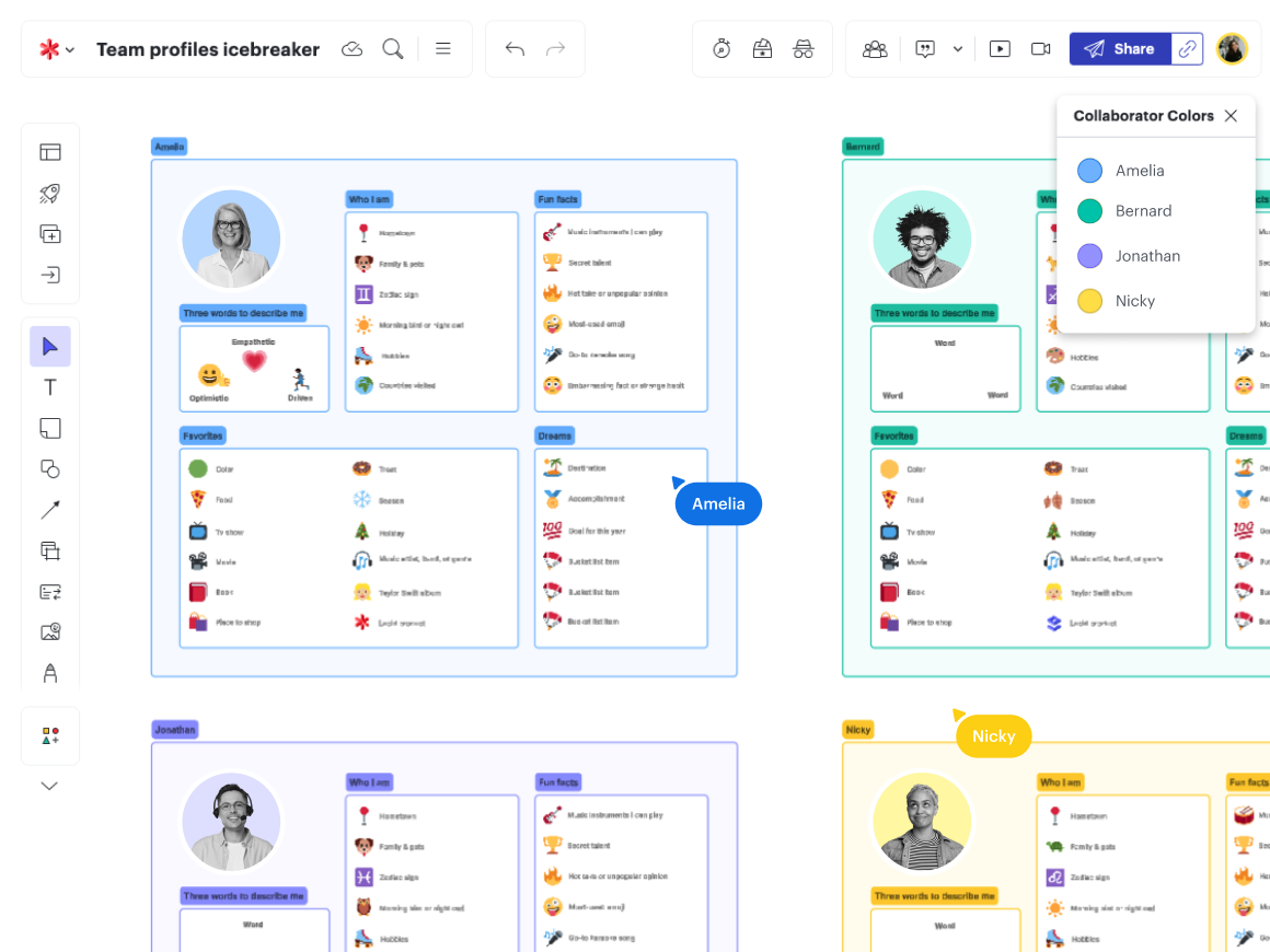
Managers can set up frames in a board with each team member’s favorite color and encourage them to change their collaborator color to a preferred shade. By using preferred colors, team members may feel more confident and included, enhancing innovation and creating a greater sense of psychological safety within a team.