Originally, the term "wireframe" referred to a visual representation of three-dimensional objects, like those used in product design and development. Now it’s also used to describe 3D modeling in computer animation and in the design and development of 2D web pages and mobile apps.
Keep reading to learn more about the value of website wireframes, how UX and UI come into play in early web and app design, and how wireframe software makes it all easier, faster, and more efficient.
What are wireframes?
In web design, a wireframe or wireframe diagram is a grayscale visual representation of the structure and functionality of a single web page or a mobile app screen. Wireframes are used early in the development process to establish the basic structure of a page before visual design and content are added. They can be created using paper or software apps or by being added straight into HTML/CSS. Because wireframes are intentionally light on visual detail, they’re best used as a planning artifact that clarifies layout, hierarchy, and behavior before anyone invests in polished visuals or code.
Use a UX wireframe to answer these questions:
-
What will be displayed in the user interface?
-
Where will elements be placed on the page?
-
How will users interact with the page elements?
-
How will the web page or application work?
Wireframes vs. mockups vs. prototypes
Teams often use these terms interchangeably, but they serve different purposes at different levels of fidelity. Wireframe diagrams differ from mockups and prototypes because they’re meant to be a low-fidelity representation focused on layout and functionality. Think of a wireframe as a blueprint that shows proposed features and how a product is expected to work. Keeping it simple makes it easier to review and refine the plan as you go.
Most wireframe diagram examples include simple lines and boxes with little color and only the most basic details. These simple shapes represent UX elements such as menus, buttons, content, and navigation functions. For example, a simple rectangle with the words "Logo/Home Page" can represent where the company's logo will be placed and that the logo will link to the website's home page.
In contrast, a mockup is more like a non-functioning model. It gives you a more complete idea of what the final product will look like with graphics, colors, branding, and fonts, but it doesn’t have any UI functions enabled.
A prototype is closer to a fully functional version of the final product. It can be used to demonstrate features and functionality, as well as to test UX and quality control.
The value of wireframes for website and app development
In practice, teams tend to see value from wireframes in several recurring ways.
Keeping teams focused and on track
Wireframes put every participant in website development on the same page. This means not only that designs are more carefully calibrated and content creation is more straightforward, but also that the development team has a deeper understanding of what they're building. It also prevents teams from having to hack, correct, or totally rebuild further along into the process—otherwise known as ”scope creep.”
When all stakeholders have approved the content and functionality outlined in the wireframe, the team can move forward with confidence. As the project proceeds, the wireframe can be used as a reference to help to keep various teams on task.
Delivering a positive brand experience
Wireframes also reduce brand and reputation risk by helping teams catch confusing or frustrating experiences before they reach users. When a web or application UX and UI are designed well, nobody really notices—the product works, and everyone is happy. But when you deliver a poor design, the negative impacts can cause lasting harm to your brand and reputation. Creating app and website wireframes is an important step toward achieving exceptional UX design.
Ensuring the site or app is built according to goals
Seeing features clearly with minimal creative influence allows stakeholders to focus on other aspects of the project. Wireframing sets expectations about how features will be implemented by showing how they’ll work, where they’ll be located, and how much benefit they'll provide. A feature may be pulled out because it doesn't fit into your site's goals.
Focusing on usability
Wireframing provides an objective look at link names, paths to conversion, ease of use, navigation, and the placement of features. Wireframes help you identify flaws in site architecture or features and allow you to visualize the flow from a user perspective. A focus on usability early on is especially important because it's much cheaper and easier to fix problems in the design phase than after you’ve started laying down code.
Understanding the capacity for content growth
If you know your site will grow in the near future, your website needs to be able to accommodate that growth with minimal impact to the site architecture, usability, and design. Wireframing can reveal these important opportunities for content growth and how to fit them in.
Incorporating feedback and encouraging collaboration early
To start any new project or product redesign, you want to get early input and feedback so you don't end up wasting too much time and money developing in the wrong direction. A wireframe is a great way to quickly convey ideas and get early feedback to help you design a better product.
Working with clients and other product stakeholders, you can collaborate and reach consensus about what the interface should look like, how it should function, and what elements should be included.
Sharing wireframe diagrams with your client, designers, the development team, and any others involved in the product development encourages open dialogue for feedback and collaboration to ensure that everyone is on the same page early in the project.
Enhancing Agile development
Wireframes work well in Agile environments. You can work with product managers and developers to identify which sections of the design should be developed in each iteration. By developing the product in iterative chunks, it's easier to get feedback and refine the design and development process as needed. It's always better to get feedback early before too much time has been spent on development.
Saving time and money
A well-designed wireframe can save time and money because your development team has a better understanding of the overall product they’ll build and can avoid having to fix problems later. The team won’t have to develop hacks late in the game to get features to function properly.
Other teams that use wireframe diagrams
Because wireframes support alignment across roles, they’re especially useful as a shared reference for the broader product team—not only designers.
Clients and stakeholders
Wireframes give your clients (or even stakeholders within your company, such as your marketing team) an easy-to-read overall understanding of what is being developed. Reviewers can quickly assess whether the design meets their expectations, determine if something is missing, explore available actions, and see how the interface elements are put together.
Showing clients the wireframes can surface potential issues or missing items that were previously overlooked or not considered. It’s much easier and less expensive to fix issues when building wireframes than to try to fix problems after the code has been written.
Project managers
Project managers use wireframes to ensure all stakeholders are on the same page. Sharing the wireframe with everyone makes it easier for all to see where the project is going, identify problems that may arise, suggest improvements, and agree on what will be built.
Project managers can use wireframes as a checklist to track progress and ensure that everything is implemented as agreed.
Developers
Developers use wireframes to understand technical requirements and identify where they may need to implement specific functionality. Several wireframes used for building a storyboard help developers determine how user interactions should or can work together. Storyboarding with wireframes gives developers a sense of how data should flow and helps them identify potential bottlenecks.
UX, UI, and wireframe design
User experience (UX) design is a method of increasing customer loyalty and satisfaction by improving usability and enjoyment in the interaction between the customer and the site, app, and product. User interface (UI) design is closer to graphic design, though the responsibilities are somewhat more complex. In general, user experience design comes before user interface design. UX and UI tend to, and should, overlap in the wireframe design process. The areas of focus include:
Information architecture and wireframes
Part of the overall process in website development and wireframing, information architecture is about placing and prioritizing information in a way that leads to understanding by future users of a site or mobile app. There are four fundamental elements, according to Information Architecture for the World Wide Web:
-
Organization schemes and structures: categorizing and structuring information
-
Labeling systems: representing information
-
Navigation systems: moving through information
-
Search systems: looking for and finding information
Good information architecture begins with a comprehensive business analysis to develop a content strategy for a big picture of structure, content, and design based on company goals. To confirm that the analysis and strategy are correct, wireframes and paper prototypes are an important first step. Testing prototypes and wireframes is the best way to get feedback from users early in the design process, which helps to prevent costly redesigns once the site is live. Prototype and wireframe testing also help you assess various designs in terms of performance and user preference to create the best overall product.
At the wireframing stage, information design is also about anticipating what different user types need to see first and what actions they’re likely to take. As an example, if your website provides a messaging service, most users visiting the site will fall into one of two categories: returning users and new visitors. Returning users will likely want to sign in, and new visitors might want to create an account or simply learn more about your service. On your homepage, you need to account for each type of visitor and provide them with enough information to achieve their respective goals. Perhaps this information is communicated via buttons: log in, sign up, or more info. Information design is about deciding what to include and where to place it.
Navigation design and wireframes
The navigation system includes an array of on-screen elements that allow the user to move from page to page. The navigation design should make clear the relationship between links so users naturally understand their navigation options. Typically, websites offer multiple navigation systems, such as a global, local, supplementary, contextual, and courtesy navigation.
As the name suggests, navigation design determines the ways in which users move through your app or website. From any given screen, a user can navigate to a number of other screens. They won’t know this, however, unless you tell them: Drop-down menus, clickable links, and scrolling bars are all examples of visual elements that help users navigate your product.
User interface design and wireframes
UI design involves picking and arranging interface elements that help users interact with system features in a way that maximizes efficiency and ease of use. Common UI elements include buttons, text entry fields, checkboxes, menus, and radio buttons.
Interface design brings it all together: information, navigation, and everything else in your wireframe. Both navigation design and information design have on-screen components such as buttons and menus. Interface design refers to how elements are incorporated into the user interface as a whole, including text boxes, header images, and sidebars.
Types of wireframes
There are four different types of wireframes:
-
Basic wireframes. Also known as low-fidelity renderings, these are very simple page schematics, usually in black and white.
-
Annotated wireframes. These add a broad range of details to a basic wireframe. Annotations are brief notes, typically on the side or bottom of a wireframe, that describe each item on the wireframe, usually separated by areas of content and functionality, and show (briefly) the reason and purpose for each item.
-
User flow wireframes. When annotation is not sufficient to show how a site or app user will logically move through content from page to page, more information may be required. These user flow wireframes can be static views of a fully interactive wireframe, but they could include a slideshow or a collection of wireframes in series to show a primary user flow or set of user flows.
-
Interactive high-definition wireframes. You can experience interactions (e.g., taps, clicks, and swipes) within or between individual wireframes. Adding interactions before going to full mockups or live prototyping saves designer and developer hours. This variation of wireframes can only be done in presentation and graphic design software or in wireframing and prototyping software.
How to design and create a simple wireframe
Now that we've looked at the fundamental components of wireframes, let's take a look at how to put it all together to design and create a simple wireframe.
And remember: When it comes to wireframing, the earlier you start, the better.
-
Think about the ultimate goal of the website, and design with that goal in mind. Think about how the user will interact with the interface.
-
Start with a simple, low-fidelity representation of the webpage segmented into three parts: the header (the first thing users will see at the top of the page), the body of the webpage, and the footer, which usually holds less important information.
-
Next, think about navigation. Add buttons and links for users to visit the main sections of your site, including content areas, search, and user log-in.
-
Annotate your wireframe for clarity.
Once you've gotten to this stage, you can share the wireframe with stakeholders before moving on to the next step. You can draw out the initial wireframe by hand on paper or a whiteboard, but once you've gotten to the final stage, you’ll likely use software to develop the wireframe further.
If you’re designing anything beyond a single landing page, it also helps to plan the set of screens you’ll need before you start drawing individual layouts. Whether you’re wireframing for an app or a website, there’s one thing you can be sure of: You’ll need to create more than one wireframe. Wireframing is all about user flow. How does the user move through your app? Is there a certain place you want them to end up?
Different projects require different workflows, but as a general rule, you should draw up your first wireframe in either the initiation or planning phase of the project life cycle. Before you start on your diagrams, map out the possible routes a user can take, listing each new screen they might encounter. For each additional screen, you’ll need an additional wireframe. Wireframes also tend to evolve in fidelity as a project moves from early exploration to concrete planning.
This preliminary work may seem overkill, but it’s worth it. Jumping right into the wireframing process without a clear idea of user flow leads to confusing and messy diagrams.
A more detailed, step-by-step workflow
If you want a more granular process than the four steps above, the following workflow can help you move from rough layout to shareable, higher-fidelity wireframes.
1. Start adding basic shapes
After thorough planning, you should be ready to draft your wireframe. Start by selecting a “frame” for your diagram. If you’re creating an app wireframe, select a shape similar to the screen of a mobile device. For a website wireframe, choose a shape that resembles a browser window. Most digital wireframing platforms will have both basic frames available in their shape library.
Next, add the largest elements of the wireframe. These should be basic shapes and containers, which represent items like a header bar, side column, or text box. There’s no need to include text or images at this point—just establish the general layout. Repeat this process for each wireframe you need to create.
2. Add buttons and links
Once you’ve established the layout of your wireframe, it’s time to add some functionality. On any given screen in your product, there are likely several buttons that will direct the user to a new screen. You may have added these as shapes in the last step, but if not, select a basic shape to represent each button and add them now. You can also add any text that will appear on the button (“home,” for example). If your wireframing platform includes linking capabilities, link each button to the wireframe it should direct the user to.
3. Gather feedback and edit
Now it’s time to share your wireframe with other stakeholders for feedback, revisions, and approval.
4. Add detail
At this point, your diagram is likely a mid-fidelity wireframe. With the basic design approved, you can begin to refine the details. Add images and text. Use color to differentiate various elements on the page, but stick to grayscale. Make sure everything is the proper size down to the pixel.
5. Share your wireframe
You should now have a functional, high-fidelity wireframe. Share them with project stakeholders and relevant teams.
Wireframe templates and examples
Wireframe templates can help you design a new web page or application faster. Most software applications for site and app design provide a wide variety of templates.
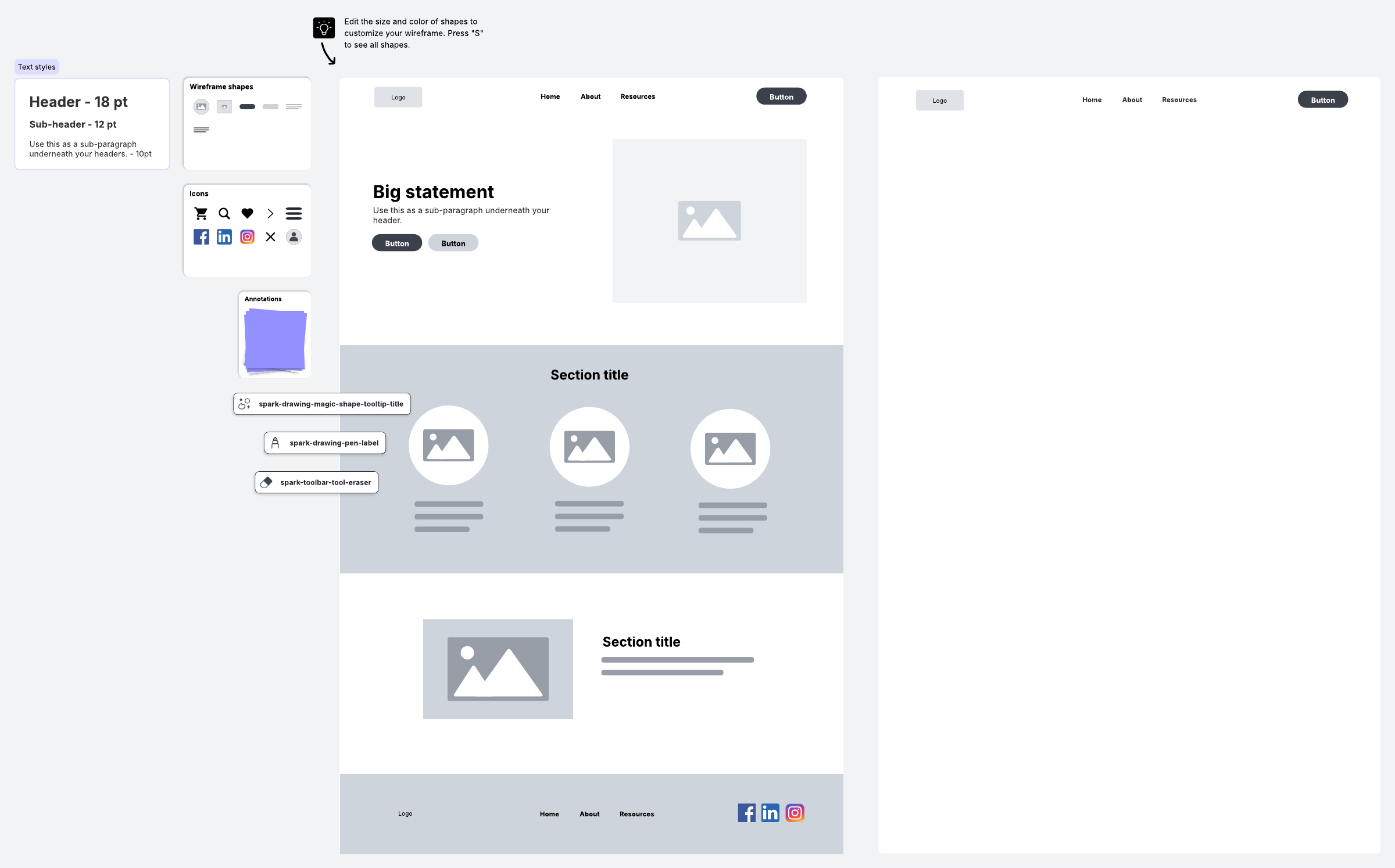
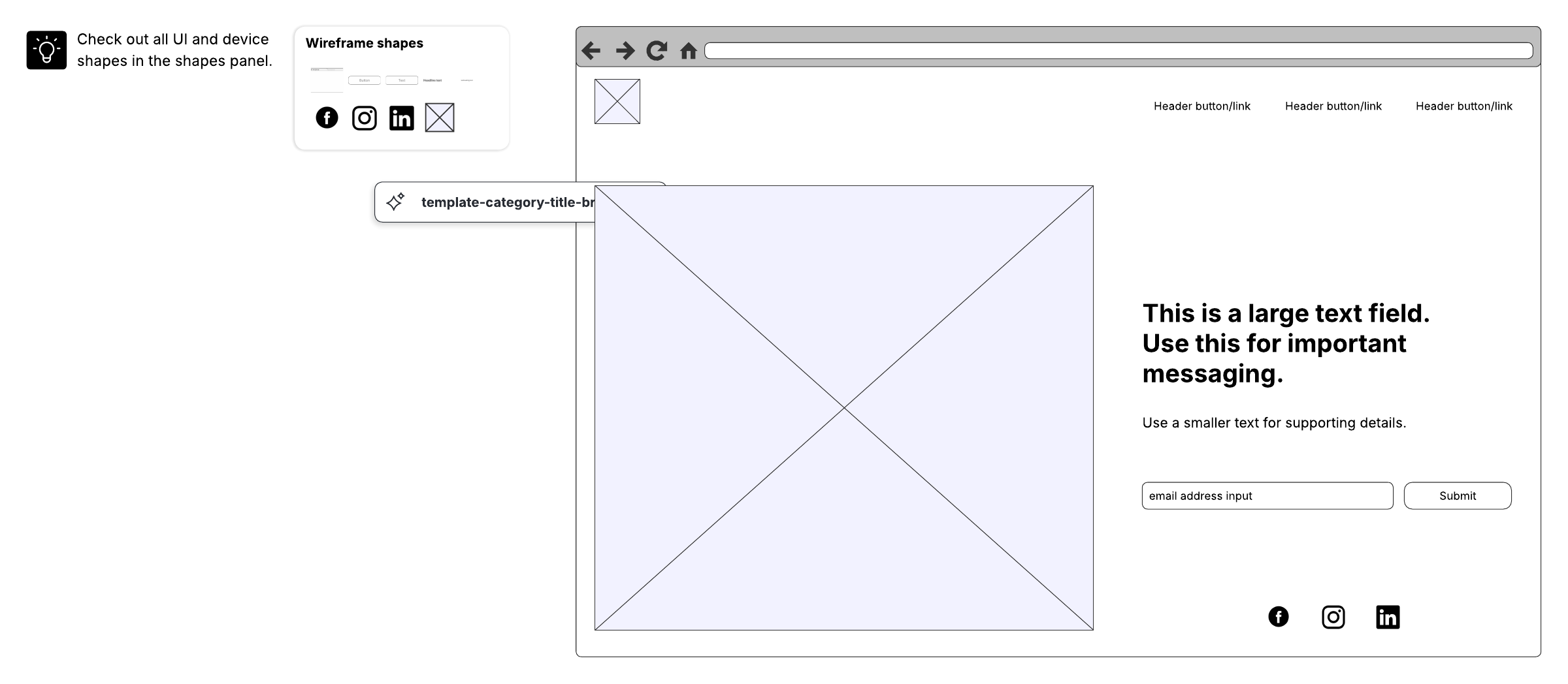
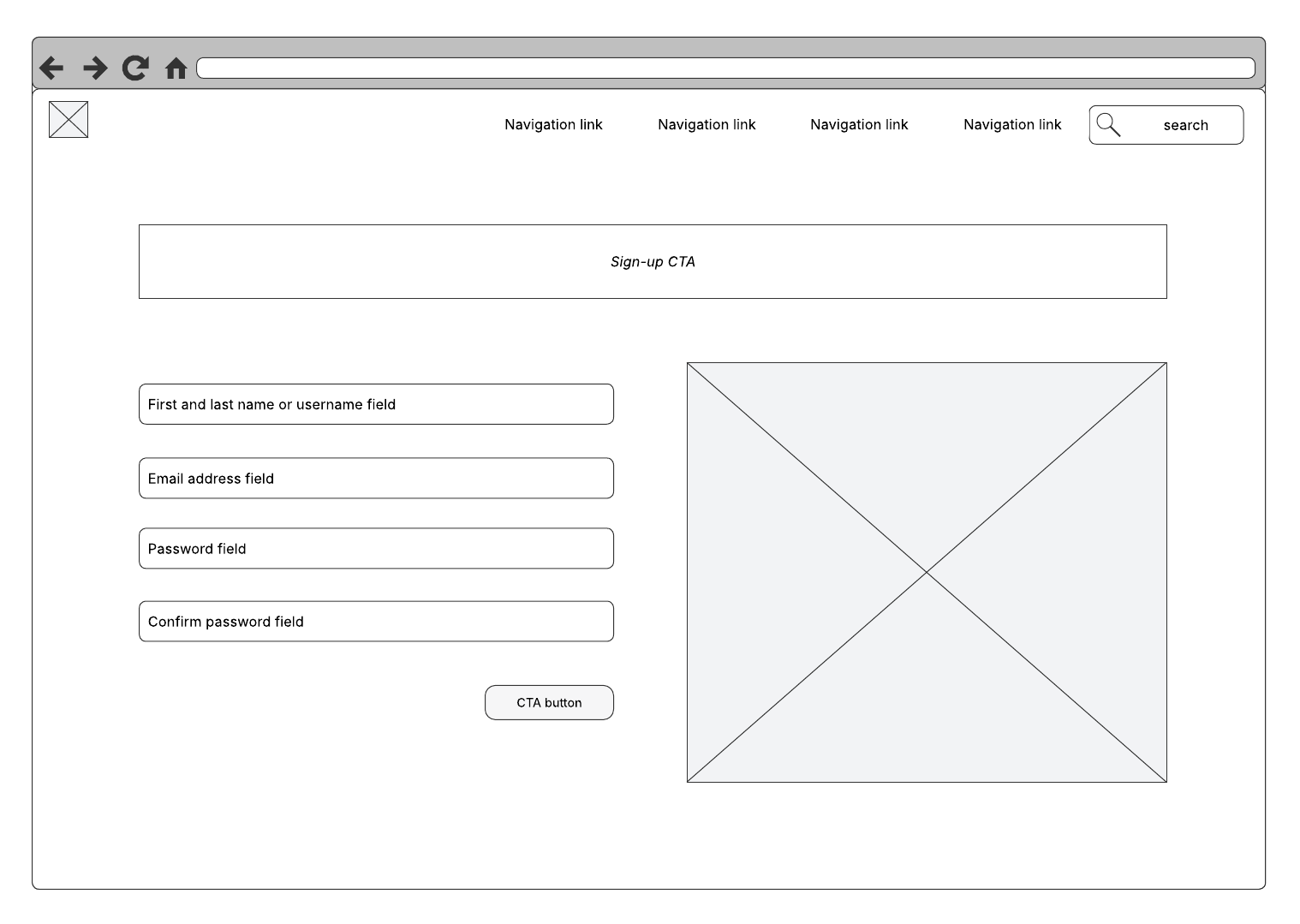
No matter what industry you're in or what platform you’re designing for, wireframes can help you design and execute the perfect user experience. Take a look at these wireframe examples, including some combined with user or task flows.
 Click on the image to modify it online.
 Click on the image to modify it online.
 Click on the image to modify it online
 Click on the image to modify it online.
Using wireframe software and tools to design webpages and apps
You can try to imagine the end result of a website or app in your head, but it's much easier when you create a wireframe beforehand and get to know what you need to do before starting. Wireframe software and tools allow you to create example designs with flexibility and time-saving features. You can expand on ideas, see the bigger picture, and avoid mistakes along the way. Templates can make it even easier to quickly visualize your ideas, make adjustments, and work through and resolve any issues.
Wireframing tools can also make it easier for non-designers to contribute meaningfully to early UX conversations. UX designers often use wireframe diagrams to demonstrate to clients, product designers, and other team members how the UI will look and work. However, product managers and other stakeholders can also use wireframes to communicate the functionality or design they’re looking for—even if they don't have as much design experience.
Mockups and mockup tools
Wireframes are design placeholders, but a mockup fills in the visual details, like colors, typography, and brand elements. While the mockup shares the wireframe's purposes of documenting and coordinating the team's vision, it has the extra benefit of its superior visuals, which make mockups more useful to decision makers. In essence, the mockup adds visual flair to the sketch laid out in the wireframe.
How to evaluate wireframing apps and software tools
Wireframing software should make it easy to develop any of the four types of wireframes—basic, annotated, user flow, and interactive—quickly and simply. Here are some things to consider before you make a decision:
-
How real does it need to be? The design capability of some software is very simple and looks hand-drawn, while others are closer to that of a minimal prototype with a more finalized user experience and interface. What you choose depends on how finished your end product needs to look.
-
Is sharing a priority? Some products have the ability to export wireframes in a variety of formats, while others require anyone viewing the design to have the product installed on their computer. Users looking to share their design with a large number of people need a program that makes sharing for review, collaboration, and approval easier, like those that are online or cloud-based.
-
What platform do you prefer? Users looking for sharing and team design capabilities on a variety of computers will likely demand a product with online or cloud-based access.
-
Do you need offline access? Browser-based products are strictly available via web browsers. Users with browser-based products may not be able to save designs locally or work without internet access. Browser-based products tend to be more lightweight and updated more frequently, but may lose offline access as a result.
-
Are you looking for templates and libraries? These make creating wireframes much easier. Software that offers templates for mobile applications, web-browser designs, and other formats is a big time-saver and is especially helpful when designing a large number and variety of wireframes. In addition, many wireframing products provide libraries of icons, widgets, and themes.
Why Lucidchart is the best application for wireframing
Lucidchart enables technical and non-technical users to create wireframes on any internet-connected device without downloading software. Lucidchart is known for its:
-
Simplicity: Drop-down menus, buttons, and general elements will help you sketch out a new concept or improve an old one. Actions allow you to mimic website navigation by moving from page to page, linking to an external page, playing a video, and more.
-
Security and reliability: When you create diagrams in Lucidchart, your changes are securely saved and stored in multiple locations. We'll even notify you if connectivity issues stop us from saving your latest draft.
-
Interactive elements: Don't just rely on a static wireframe. Instead, build an interactive mockup that offers the ability to click buttons, watch videos, browse menus, and try other links.
-
Smooth collaboration: Reduce development time by having everyone participate in the process. Your customers, content producers, and programmers can easily chat and offer feedback.
-
Rich features: Clients will appreciate an interactive wireframe that demonstrates the user experience. Give your designers and clients a functional prototype of an app or website.
-
Easy publishing and sharing: When you're finished with your wireframe, sharing it is simple. Save to a variety of image file formats, print it out, or send it via email. You can even publish it on social media or share it privately for feedback purposes.
Start a free Lucidchart account to create wireframes and start designing for the web.
Sign up free