
Organizational charts, or as they are more commonly called, org charts, were created in 1854 to visually represent an organization and improve communication. Since then, they have become a vital internal tool to allow teams to comprehensively and visually understand a business's operational framework.
However, now that org charts have become the norm in many companies, these documents have become difficult to navigate. They often contain several departments and organizations, creating clutter and making it difficult to extract information at a glance. Additionally, they can be difficult to maintain with employee turnover, promotions, and organizational restructuring.
With Lucid, you can make this essential document functional and interactive for a more organized and valuable experience. In this article, we’re exploring several ways to do exactly that.
Import your data
One of the biggest challenges of an org chart is keeping the document up to date, which can be difficult with internal changes. To simplify this process, Lucid org charts allow you to import data, or if you have an enterprise-level account, you can link your data to a document in Google or Microsoft Excel.
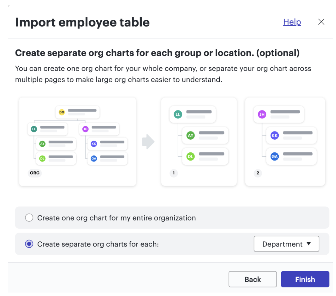
When importing your data for the first time, you will receive an optional prompt to separate the org chart by location, department, group, etc. Separating your org chart will allow employees to easily navigate to relevant information. You can choose to separate by location if you have global employees who report to managers within their location, or you can choose to divide by department if employees are widespread but operate internationally.
This option will divide up your org chart into different tabs, making it easier to digest.
Customize group views
Another option to organize org chart data is by importing your whole org chart and creating group views. This feature also allows you to categorize your org chart. However, it is limited to viewing in a one-page tab, rather than creating separate interactive org charts for each group with their own tabs.
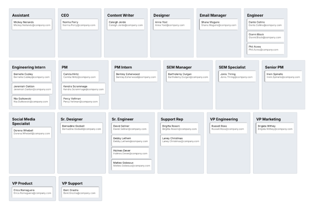
You can create group views to see any column of data in your imported data. For instance, you can group by role, location, supervisor, etc. Here is an example of dividing by roles, allowing teams to quickly identify points of contact.
Additionally, you can customize the view further by limiting the data shown on the page. For instance, if you want to create a page to quickly identify company leadership, you can open the contextual panel on the right-hand side to only show leadership roles.

Design a navigation page
Make your document even more interactive by linking to page tabs, allowing you to easily navigate to specific views. Create shapes that coordinate with your page tabs in your document, then click the Link to option, and add the page you want the shape to direct to. Designate this page in your first tab so employees can navigate the document from here.
To go one step further, add a shape to each of your page tabs to navigate back to the main page. This will simplify your document and allow employees to return to the table of contents.
Utilize conditional formatting
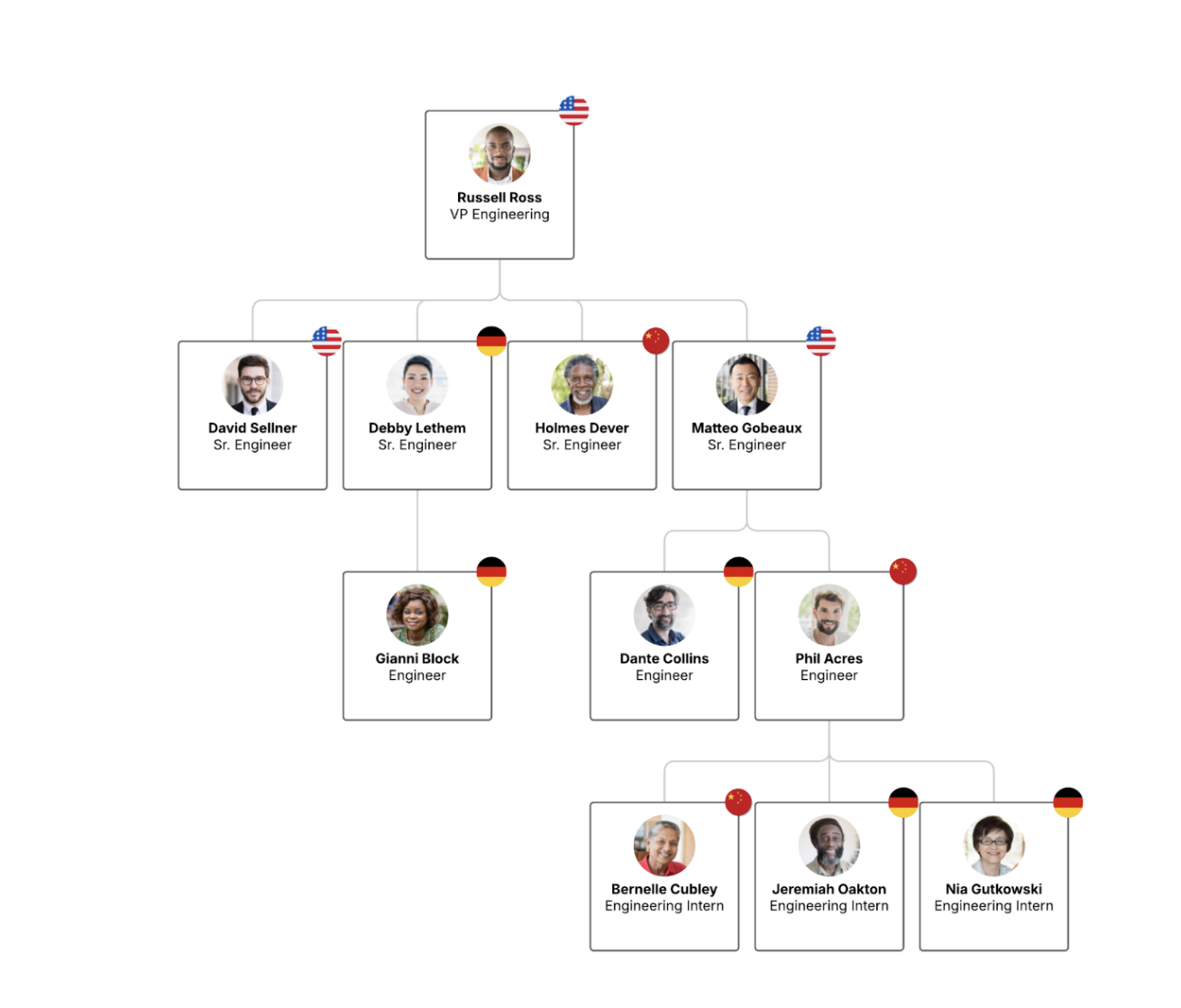
Conditional formatting can be used alongside org charts to visualize your imported data. One of the most impactful ways to do this is to make employee locations easy to see by adding flag icons to org chart shapes.
Use color to distinguish managers
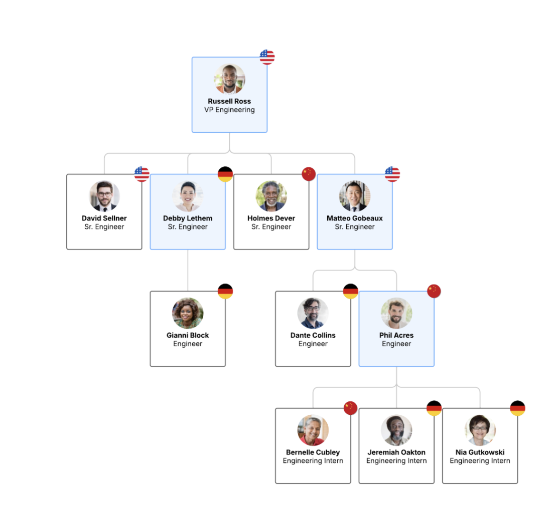
You can use conditional formatting in so many ways to highlight data and specific shapes. Another way to do this is to create a rule to color shapes with connections greater than one. This will highlight managers in your org chart, allowing you to see leaders in the department and making it easier for stakeholders to find points of contact.
Use Lucid to create an interactive org chart
Lucid makes visual collaboration and customization easier with our extensive charting features that make your org charts interactive and organized. Whether you are looking to create one for your department or your entire organization, Lucid’s capabilities make it easy to design a captivating org chart.

Ready to dive deeper into making an org chart with Lucid?
Learn more