Learning how to measure a design system’s success

Brooke Rhees

Reading time: about 11 min

Topics:

  • UX
During the summer of 2020 we weren’t just building Lucidspark, we were also in the early stages of establishing our design system. We’d built the basics: Component library in Figma? Check. Code components? Check. Basic visualization for the code components? Check. We had a healthy grassroots culture growing around the idea of using core design system components (like buttons!), and were eager to start finding out how well the design system was working for people and where it could improve. The obvious but challenging question was, how do you measure the success of a design system? We wanted to be deliberate about this, because we understood that measuring the wrong thing could have serious consequences for the actual success of the system. As we considered the idea of success and all its existential meaning, we narrowed our focus by considering our design system goals: consistency for the end user and velocity for the development org. “Consistency for the end user” means we are providing predictability, usability, and accessibility in user interactions across all our products. We want our end users to be happy, and predictable, usable, accessible buttons make everyone happy. In the pursuit of consistency we realized  we might want some measure of how consistent our codebase was relative to current standards and how it impacts engineering velocity. Measuring consistency in the code seemed straightforward enough, the hard part would just be ensuring our measurement had a reasonable amount of accuracy. On the other hand, measuring how the design system impacts development velocity is…much more elusive. How using one button instead of another increases anyone’s velocity is quite frankly impossible to measure at small scale, and most changes happen at small scale. After discarding the idea of putting together timed trials that would be easy to game (“Okay, build it from scratch…. Now build it using this!”) it seemed likely that an “engagement” heuristic would provide a better measure of the overall success of the system. After all, what’s the point of a design system if no one is using it? Armed with these theories, we explored several different approaches to measuring success, and after some trial and error, found two that gave us our greatest confidence. 

Theory #1: Engagement correlates with velocity

Engagement, like velocity, is a vague concept. However, by considering the concept of a design system as a set of processes and interactions that people are working within, we believed there could be things we could measure related to those interactions that could correlate either positively or negatively with velocity. Our theory was that the people most likely benefiting from a system were the ones choosing to engage with it. We just needed to figure out what interactions mattered.

Attempt 1: Slack comments

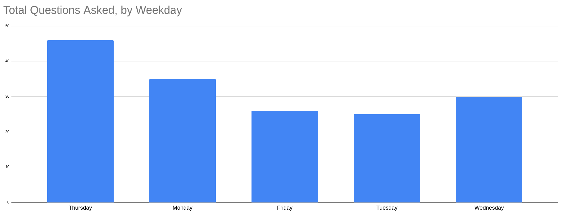
The first metric we considered was around tracking the interactions we had on our designated Slack channel. Number of comments or questions asked was a trivial metric to calculate and might have been a reasonable heuristic for how easy to use our components were, or how helpful the design system team was. The question was, would a higher number of comments or a lower number of comments indicate better engagement? We weren’t sure. So we started digging into some historical data, and the findings were interesting. For example, we could easily see that the number of questions about tooltips dropped a lot within a few weeks after a new version was released. Interesting, and potentially meaningful. But as we explored that idea, we quickly realized there were too many confounding factors for that to feel meaningful or informative. Though a changing number of interactions could be an indication that we had made a component easier to use, it could also be an indication that people were disengaging from our channel. Or it might just reflect when people reached a certain phase of their workflow–for example, we found a strong correlation between day of the week and number of questions asked. Graph of questions by weekday, with Thursday having the highest number Incoming questions frequently also tied into what happened to be going on more broadly, so we saw noise from how many mocks were shared out at a given time, or whether those mocks just contained fewer tooltips than they used to. Though we could use this data to gain some interesting insights, the overall picture wasn’t concrete enough to provide information on how engaged people were feeling.

Attempt 2: Feedback survey

The next thing we explored to measure velocity through engagement was a quarterly feedback survey. We intended to see if we could simply track public opinion using three questions which respondents could answer using a sliding scale. The questions focused on how much the respondents felt the design system helped them work faster, better, and more consistently. It also included one longform request for feedback. We sent the survey out over Slack every quarter for a year, and analyzed the results. Our hypothesis was that we could benchmark how impactful the design system was at the beginning, and then track over the year whether people’s responses trended up or down. It seemed like a good quantitative measure at first. However, we found that the number of respondents dropped drastically after the first two quarters, and when the responses represented less than 10% of our audience, the numbers became pretty meaningless. The tenure of the respondents also had a heavy impact on scores–more seasoned engineers consistently gave higher scores than new hires. While we could have differentiated between them, by this point we were in the single digits for number of respondents, so there wasn’t much value to differentiation. However, we were able to use the longform responses from the survey to get direct feedback on where the system fell short or was doing well, which helped us determine where to invest next. Overall, it was useful as a direction-setting device but wasn’t as useful for benchmarking success. We retired it at the end of that year.

Attempt 3: Testimonials

We finally decided to take a purely qualitative approach by using testimonials to determine how well we were doing. We requested feedback directly from people who had recently interacted with a member of the design system team, and asked them specifically how that interaction went and if they’d gotten the help they needed. To minimize bias, we also looked for unsolicited comments in meetings, Slack channels, and side conversations that related to the design system. This “feel-it-out” approach quickly became our preferred approach for measuring success from an engagement perspective. When people talked in glowing terms of some piece of the design system that they loved, or how the design system team was doing great work, it was clear evidence that the system was working for them. Comments in Slack about frustrations or concerns with the design system were evidence that the system needed more work, and gave us direction on what to focus on. While this approach isn’t very quantifiable in a meaningful way, we’ve found for our purposes that it doesn’t need to be. It gives us what we need and works well with our more quantifiable theory around adoption.

Theory #2: Adoption indicates velocity + consistency

Tracking adoption of components as a measure of consistency felt like an obvious approach. If a standardized button component is used in the code, it means your end product is more consistent with standards. If not, it’s not. But we theorized that adoption tracking could also serve as an additional velocity heuristic. If people voluntarily start using the standardized button component rather than building their own or using an old version, it seems reasonable to assume it saves them time or effort in some way. If it doesn’t save them time, you’re likely to hear about it before the code is merged (which is where that “engagement” heuristic comes back into play). That being the case, tracking adoption could potentially provide insights into both consistency levels and impact on velocity–a double win! Actually tracking adoption comes with a lot of nuance though. The immediate question we were faced with was “what are we even trying to track?” Because our design system components are largely built in Angular, trivially we could just grep for a list of Angular selectors representing each component, and watch to see if numbers are trending upwards. grep -r lucid-button. Easy. Including “inconsistent” search terms as well to calculate a consistency percentage gives us a better holistic estimate for how well overall our products follow design system standards.  But what if we want to explore more complex parameters? We had to consider these real-world examples:
  • Requiring that all buttons have a given input, such as a required aria-label for an icon-only button
  • Flagging whether a button is styled with a given CSS class which overrides the standard consistent styles
  • Guaranteeing that a standard “consistent” button never includes both an aria-label and a label, because labeling things is hard
  • Combining all these requirements for a component such as a menu, which is way more complex than a button
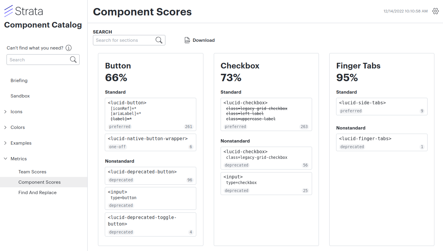
Suddenly a simple grep for a component is a lot less simple. So, we built out an HTML parser that could handle complex component implementation definitions, taking into account things it should include or exclude, expected inputs or CSS classes, whether to parse HTML or LESS files, and more. We could even divide out ownership of different code areas to individual teams, and calculate scores on a per-team or per-area basis. From there, it was only natural to integrate this data into a dashboard on our Component Catalog, including trends over time, so we could always have live, at-a-glance information right at our fingertips, no grepping necessary.

Benefits

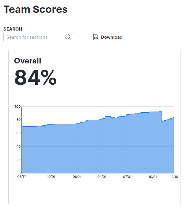
Trivially, this metric allows us to see whether people are using the design system components in their everyday work. But what was more valuable was the way we also could use this metric to introduce a sense of accountability and ownership for using the system. When we started adding visibility to the numbers and starting holding teams accountable, we found that our consistency began steadily increasing, and we received more feedback for improvements. By using this adoption metric with our other engagement metric, we could really understand how successful the design system was. Graph showing consistency trending up over time

Limitations

One big limitation to this system is that we don’t know what we don’t know. Our parsing system can only track what it knows about, and things fall through the cracks. We’ll never be able to tell if we’re perfectly following design system standards, even if everyone has 100% on their scorecard. But we’re okay with that. It doesn’t have to be perfect–it’s a heuristic.

Takeaways

Measuring success is a tricky thing. It’s easy to set up metrics that are easily gamed. It’s also easy to read too much into what the data is actually saying, or to dismiss the data as meaningless. Measuring the wrong thing and holding people accountable for it can introduce incentives that undermine your whole goal. Focusing on consistency and velocity as the specific goals of our design system allowed us to explore various ways to measure its success and ultimately find what works best for us. Using the lenses of engagement and adoption, we discovered which of several heuristics we could use more effectively to determine whether we’re on track, and which would distract us from our ultimate goals. We also learned to recognize the ways our chosen metrics could easily become inappropriate if we fail to understand their limitations or rely too heavily on attaining an ill-chosen goal. We know our metrics are just heuristics and have limitations. This keeps us honest with ourselves and more open to feedback, so our buttons keep getting better, our devs keep building faster, and our end users feel continually more delighted. And that’s all we want, really.

About Lucid

Lucid Software is a pioneer and leader in visual collaboration dedicated to helping teams build the future. With its products—Lucidchart, Lucidspark, and Lucidscale—teams are supported from ideation to execution and are empowered to align around a shared vision, clarify complexity, and collaborate visually, no matter where they are. Lucid is proud to serve top businesses around the world, including customers such as Google, GE, and NBC Universal, and 99% of the Fortune 500. Lucid partners with industry leaders, including Google, Atlassian, and Microsoft. Since its founding, Lucid has received numerous awards for its products, business, and workplace culture. For more information, visit lucid.co.

Get Started

  • Contact Sales

Products

  • Lucidspark
  • Lucidchart
  • Lucidscale
PrivacyLegalCookie privacy choicesCookie policy
  • linkedin
  • twitter
  • instagram
  • facebook
  • youtube
  • glassdoor
  • tiktok

© 2024 Lucid Software Inc.