How data-driven visuals can cure spreadsheet fatigue and inform business decisions
Jamie Lyon
Reading time: about 3 min
Topics:
Organizations have never been better at collecting data. Departments have their own systems and means of gathering a variety of business intelligence and customer information. However, with this ease of access, we often see data overload and excessive complexity.
This is especially true in how data is typically organized and leveraged today—in rows and rows of spreadsheets. Data in this static, hard-to-read format can lead to inconsistent analysis, siloed results, and conflicting versions, among other issues.
Visualization makes data more coherent, offering clarity and understanding. Applying and utilizing data effectively in today’s data-saturated world calls for the use of visualization as an entirely new approach to really allow these vast amounts of data to drive better business decisions.
Why your teams need data visualization
A common visual language gives teams (regardless of their background) a comprehensive view of the big picture, helping teams reach a shared understanding in a fraction of the time it would take with spreadsheets. At the same time, visuals can highlight critical dependencies and potential bottlenecks.
Achieving clarity around data quality, relevance, and meaning also allows leaders to make more effective decisions. This alignment makes it possible for stakeholders to move into action more quickly, and therefore, drive the business forward more effectively.
Because organizations' needs change quickly and often, it's not enough to visualize a fixed data set. You need visuals that update as your data changes.
This is where solutions like intelligent diagramming are valuable, allowing teams to quickly see data in real time and make action plans accordingly. These organizational tools make data more accessible to all stakeholders in an organization, from individual contributors to C-suite executives.
How intelligent diagramming helps contextualize data
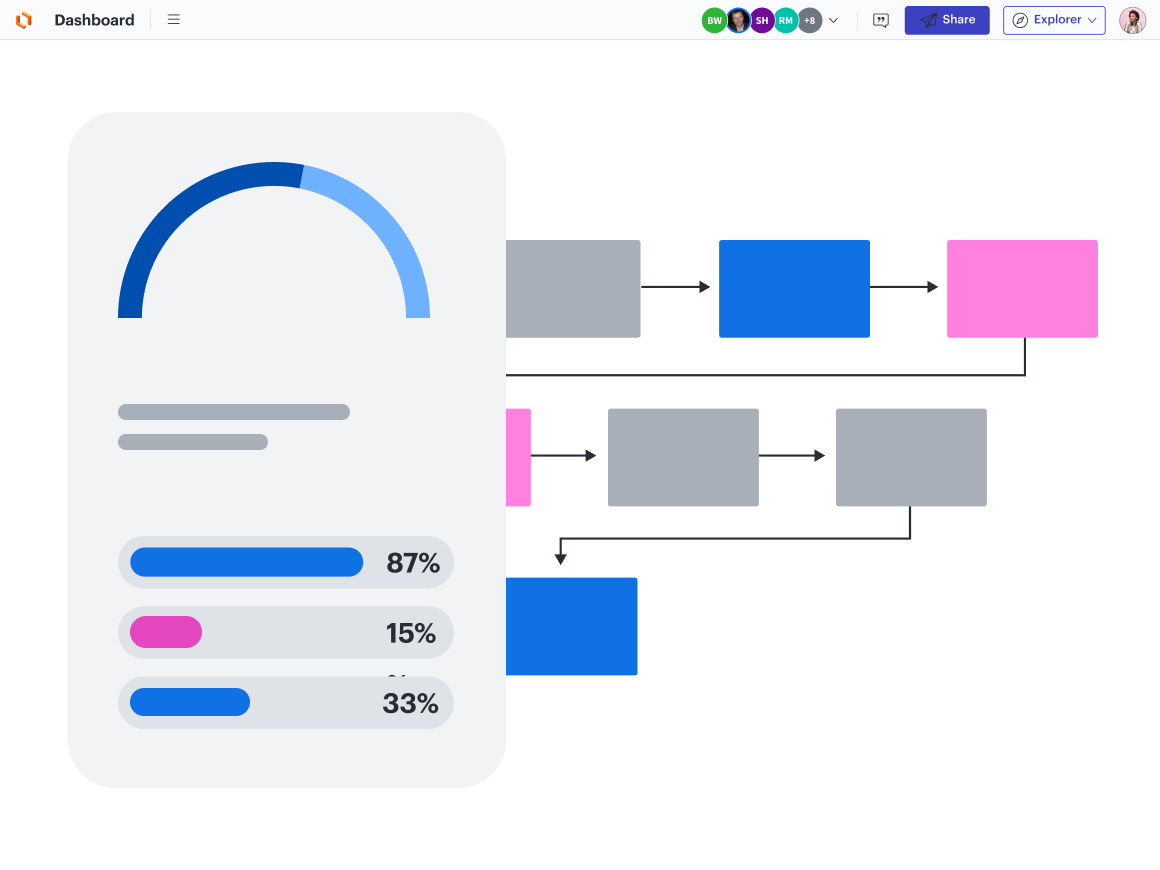
While all visualization is a step above text-heavy documentation, leveraging the power of dynamic visuals takes things to the next level. Dynamic visuals let teams link data to shapes to create highly intelligent dashboards, diagrams, charts, reports, and more.
This is all possible through intelligent diagramming, which boosts smart features such as data linking, conditional formatting, and automation. Looking for places within your manual workflows to add automation and other intelligent features means greater efficiency and faster data-driven decisions.
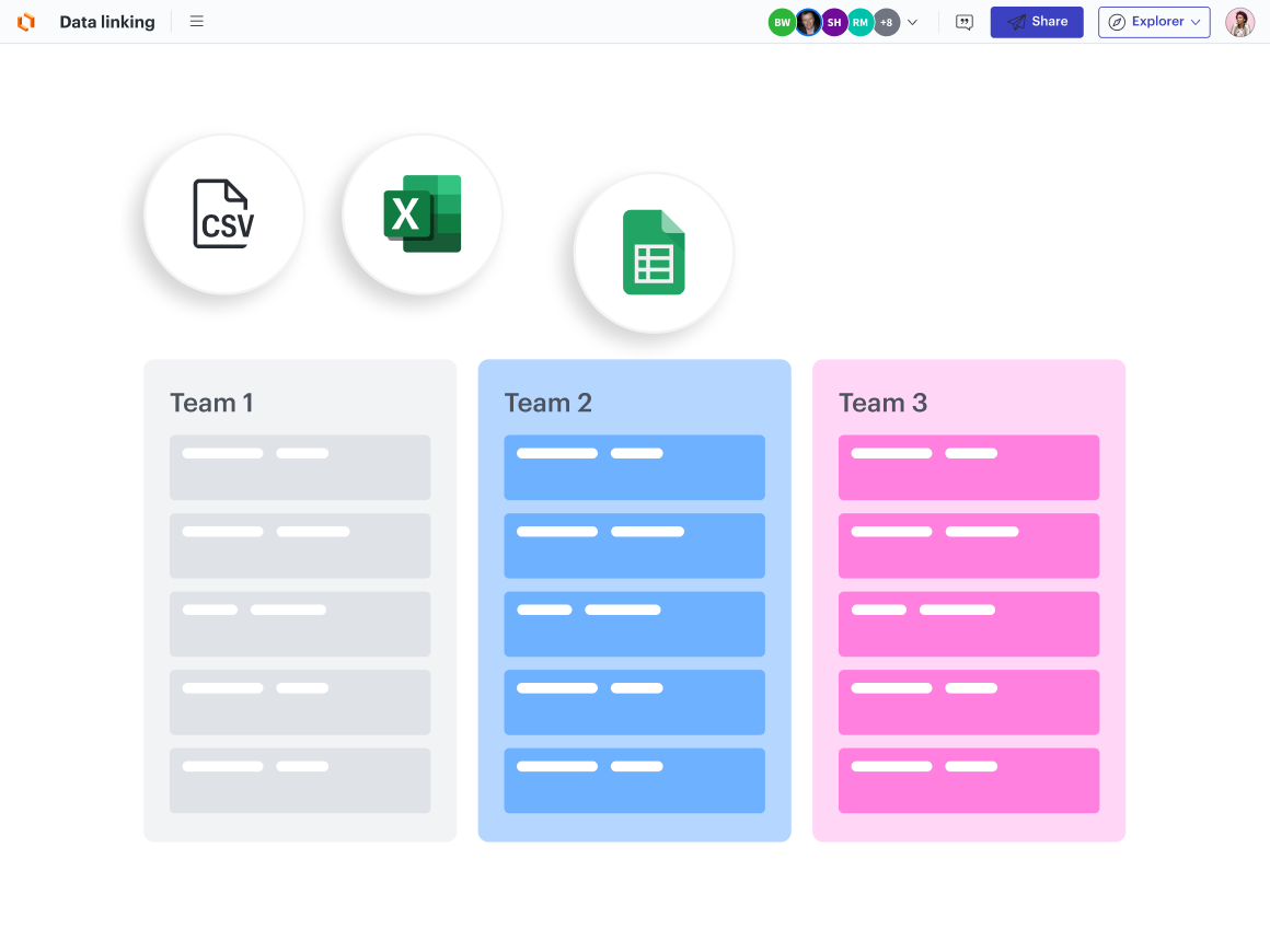
When you link live data from your files and systems to the diagram, your documentation transforms from a static resource into a living blueprint. This connection transforms a spreadsheet from a singular dimension to a more dynamic view, adding critical, real-time context.
Use cases for data-driven visuals
Any function that collects and uses data (i.e., nearly every business function today) can benefit from visualizing data. Let’s take a look at a few use cases:
- Transforming customer feedback to a customer journey: Data from customer feedback easily becomes the customer journey when visualized. The experiences behind the responses become more obvious when seen in a visual format, so teams are better positioned to make higher-value improvements.
- Closing deals quickly with prospect data: Sales teams can collaborate and align in real time to close bigger deals faster. Visualizing prospect data from the CRM ensures sales reps are talking to the right people at the right time.
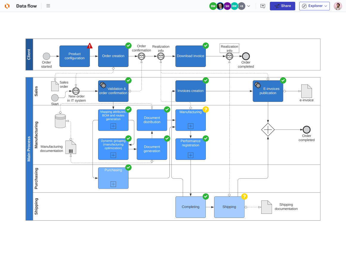
Navigating data governance challenges: Evaluating the effectiveness of data practices is another valuable use of visualization. Mapping out the data flow quickly reveals security, privacy, and operational issues.
Gain vital insights with visual collaboration
Companies run on data, but without a clear picture of what the data means they stand to lose critical insight that can significantly impact the bottom line. Solving problems, communicating visions, and setting goals is more straightforward when everyone can readily find the information they need and distill it at a glance in a visual format.
Organizations that can visualize their data more effectively can also share it and analyze it more easily with a variety of stakeholders. The result is a more agile, adaptable business—one that can make smarter decisions more quickly around what really matters to drive business forward.
Create data-driven visuals with Lucid
Elevate your team's productivity by using visuals instead of static documentation. Lucid's visual collaboration platform brings your data to life with dynamic, interactive visuals.
Learn moreAbout the author
Jamie joined Lucid in 2018, driving strategic company initiatives with her impressive talent and leadership skills. After a prestigious consulting role, Jamie earned an MBA from Stanford Graduate School of Business where she was appointed an Arbuckle Leadership Fellow. She later joined General Mills as the Wheaties brand manager, securing a contract with Steph Curry before overseeing marketing, strategy, and business development at a consumer packaged goods startup. She holds a B.A. in economics and Spanish from Dartmouth College.
About Lucid
Lucid Software is a pioneer and leader in visual collaboration dedicated to helping teams build the future. With its products—Lucidchart, Lucidspark, and Lucidscale—teams are supported from ideation to execution and are empowered to align around a shared vision, clarify complexity, and collaborate visually, no matter where they are. Lucid is proud to serve top businesses around the world, including customers such as Google, GE, and NBC Universal, and 99% of the Fortune 500. Lucid partners with industry leaders, including Google, Atlassian, and Microsoft. Since its founding, Lucid has received numerous awards for its products, business, and workplace culture. For more information, visit lucid.co.